Monday, April 30, 2012

Look what came in the Mail!!

We had a wonderful surprise last week when we came home and found this on our doorstep.


That's right! It is the Large Chez Sheik Stencil from Royal Design Studio, and I can't wait to use it. Olivia will be turning FIVE in the beginning of July, and we are planning on having her room completely finished in time for her birthday.

Here's a better view of the pattern.


I am absolutely in love with it, and I'm sure I will end up using it in other spots around the house when we are finished with her room.

Our deadline (Livi's birthday) is quickly approaching, so there was really no better time than now to get started on it. I used the Sherwin Williams Visualizer to see how all of our color choices would look together in her space, and I love it!


Obviously the design below the chair rail is not what the final product will look like, but it gives us a nice idea of how the colors will work together.  
Here's a shot of the paint chips to give you a better idea of the colors, though they still don't look quite like the real thing in front of me, they are definitely closer than the visualizer image.


The colors in order from top to bottom are:
Rosebud (6288)
Ceiling
Intuitive (6017)
Above Chair Rail
Priscilla (6575)
Below Chair Rail (Stencil)
Vivacious Pink (6850)
Below Chair Rail (Base Color)

We are using ProMar® 200 Zero VOC Interior Latex. We got 2 gallons of flat for the ceiling (Rosebud), 2 gallons of low sheen for above the chair rail (Intuitive) and 1 gallon each of low sheen in  Priscilla and Vivacious Pink for the stencil below the chair rail. 


Some of you might think I'm nuts for using anything other than eggshell in a kids room, but this was a very well thought out decision. This paint is made for areas where you don't want the sheen but still need scrubbability. (well isn't that a fun word) The matte finish also helps to hide imperfections in the walls, while a higher gloss paint would reflect the light, making any nicks, dents and pops much more noticeable. We also decided that since it was going to be in our kiddos room, that the Zero VOC was our best bet.

The Zero VOC formula is pretty new at SW, but we tried it before when we painted the door in our entry, and it went on beautifully. Another big factor in our decision was the peace of mind that comes with knowing there won't be any harmful off gassing for the next couple of years. To me that is totally worth a few extra dollars. This paint is as close to perfect as it gets when it comes to a child's room. 

So, I am so excited to get started on this project, and we have a pretty long way to go before it will be finished (probably about two weeks), but I know it's going to look amazing! 

Have any of you stenciled before? Any helpful hints would be appreciated!


Saturday, April 28, 2012

Kitchen Cabinet Refinishing

Before we even bought our house we knew that the first project we wanted to tackle was the kitchen cabinets. We knew that if we waited until we moved in that we would have a whole bunch of food and kitchen supplies in our way, so we wanted to get it done before hand. 

Here's a sneak peek of how they look today!


Our first step was taking all the cabinet doors off, we numbered all the doors inside the well of the hinges, and covered them with tape. Then we started prepping them for paint. 


First, they got a good sanding with a palm sander. Then we wiped them down with a rag, followed by a tack cloth, to make sure there wasn't any lingering dust. Unfortunately I don't have photos of a lot of this because we were in the middle of our move, and I was a bit scatter-brained!

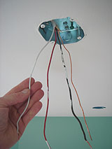
Since we were mid-project anyway, we decided to rip out that stainless steel back splash while we were at it, and I am so glad we did. To find out more about what we did to replace it, check out this post.


Once the cabinets were sanded and cleaned they were ready to be primed. We set up a temporary spray booth in our living room. In this photo you can see the construction paper on the floor, and just how crazy things were in the month between closing and moving in. We covered the opening between the dining room and living room in plastic, and sprayed everything in the opposite corner of the room. We covered the doors on this wall too, we left the walls uncovered, because we knew they were the next thing that would be getting painted.


First, we sprayed on Sherwin Williams Adhesion Primer, and when that was dry we brushed an oil based primer over any spots that bled through. We sanded everything smooth with a 220 grit sandpaper, then did a final coat of the adhesion primer. We followed the second coat with a very light sanding to make sure everything was silky smooth.
We let the cabinets sit with the final coat of primer for two or three days to make sure that nothing else was going to bleed through. We wanted to play it safe since the cabinets were original to the house (1991), and we weren't sure how much grease and oil they were exposed to over the years.

Then, it was finally time to start painting them! WOO-HOO!!! We painted the doors with Sherwin Williams ProClassic® Interior Acrylic Latex in Satin. We decided we liked the look of a white wall cabinet, and a slightly darker base cabinet, so we used Twinkle (SW 7135)- white with a slight touch of blue to it on the wall cabinets, and Zircon (SW 7667)- a light shade of gray on the base cabinets.  

We used the same colors on the faces and insides of the cabinets, that we did on the doors, but we only needed one coat of primer and two of paint. 

REMEMBER!!! When spraying, tape and plastic are your friend. Tape off any doorways into the room, tape off everything that isn't getting painted, if you don't there WILL be some kind of spatter or paint residue on it!

We sprayed the doors, faces, and insides of the cabinets with a professional sprayer that Mike borrowed from work, (if you need one check your local construction rental places, or just pick up one that is meant for homeowners, we recently got one at harbor freight for under $30!) we did two coats, allowing plenty of time in between for drying. When the were dry we left them a few more days to fully cure before they were hung.


We were so thrilled when they were fully cured and ready to be hung! 

Here's the before photo, you can see how far our kitchen has come! 
It's not all that noticeable in this picture, but a lot of the poly was beginning to peel off the doors, and they were looking very "eighties orange."


and...

the after!!


 We love our "new" cabinets SO much, and are really glad that we painted them. This was definitely the longest and most daunting task we have done in our home, but it was totally worth it. It would have cost thousands to replace the cabinets, but we spent under $200 on our supplies. 

Things I will do different next time
  • Instead of spraying the faces and insides of the cabinets, I will probably do it with a foam roller. These are much less noticeable than the doors, and a lot harder to paint with a sprayer. I would roll them purely because of the convenience and the less mess factor.
  • I think I will stick to an oil based primer and paint for everything next time. (We haven't had any problems with our finish, it looks just as great as it did in December, but I don't know how long it will last)
  • I will use a more significantly different color difference between the base and wall cabinets. I was going for something not so subtle. 

Here's a few more pictures for you to enjoy!


This is the view from our breakfast nook. Make sure you take in the wonder that is that lightning bolt on our ceiling. It will be gone, gone, gone in the next few weeks. I originally wanted to take it out right a way, but Mike want's to try to reuse the track lighting, so it was put on hold. UGH!!! Can't wait for it to be gone!


We added the knobs a little over a month ago, I love how they add some fun color to the space!


edit: We still haven't chosen a paint color for the walls in here, whenever I think I've finally settled on something I see another inspiring picture on pinterest, and I change my mind. Ugh! Part of the whole paint dilemma is that the kitchen has a chair rail. I know I want to do wither beadboard or picture frame moulding below the chair rail, and that part will be white, but that just makes it more difficult because I have to find something that will look good with that. 

What color would you choose?

If you have any questions feel free to leave a comment below or email me!


Friday, April 27, 2012

Another Free Printable!

Yesterday I shared a PDF of my post planner, and today I'm going to share another planner that I love. I keep this one above the mirror in my closet/ Mom Room. I usually print two out on a page so it's smaller, and it's nice to just keep in mind what I have coming up!
It's similar to yesterday's planner, just more basic.
Click the link you want to download the PDF:


Enjoy! Have a Great Weekend!


Tomorrow afternoon I will be sharing how we refinished our kitchen cabinets, and took them from...

this,

to this!


Thursday, April 26, 2012

Free Printable- Blog Post Planner

I have been working my tail off trying to make this blog the best that it can be, but I needed something to help me stay organized and keep all of my post ideas and schedules in one handy place. I came across Amy Bayliss' Blog Planning Editorial Calendar Printable, and it has been SO helpful, and just plain awesome! I have been using the editorial calendar like mad!
I also like her post planner, but unfortunately because my content is different it wasn't a perfect fit, so I made up one of my own. I included spaces for 5 posts, because I would like to be posting 5 times a week sometime in the near future.
This is how it's set up-


I hope that this planner can help some of my blog buddies as much as it has helped me!


Tuesday, April 24, 2012

Hutch Day

So today is unofficially Hutch Day for us! We decided to get to it, and paint our dining room hutch this morning while Livi was at school. Mike started priming it while I worked on painting the hardiboard for the new back piece.

So far it is looking really great.When Livi walked in the door she said "Oooohhh, that's great!"


This is the base coat for the back of the hutch top. It is much brighter than the top coat.


In between my base and top coats I stopped to check my email, and saw that I got an email from a guy on Craigslist who was selling a gorgeous hutch for just $25! As soon as I saw the ad I knew I wanted it. The blurry pics couldn't mask it's beauty.


It has beautiful lines and great hardware, and I can't wait to work my magic on it.
Sorry for the back of the truck iPhone pictures. I couldn't wait to share it, and we won't have the man power to get it out of there until later this afternoon. 


One of the pulls is missing, but I think I have a solution for that. Anyone else have any ideas?


Also, I wanted to let you know that our facebook page officially went live yesterday afternoon so be sure to stop by, and "like" us!

As you can see we had a very hutchy day!

Monday, April 23, 2012

Master Bathroom Update


We have been working on updating our master bathroom for about two months, and it is finally starting to get there. We finished painting, and there is no longer even a hint of that hideous red we used to have.
When we first started planning for what we wanted to do I made up a mood board, so we would have a solid plan, and something to reference. My rooms never turn out exactly as planned, but it's a great way to get started. Here's the original mood board.

See, the two lights at the top? The stripe one is our dream light, but I just wasn't able to swallow the $200 price tag, no matter how cute it is. Especially for something so simple. The other light is from cb2, and was priced a lot more reasonably at $50. We were planning on buying that one, but life got busy, and it just didn't happen, then...


I was browsing ebay when I found this light.
It's from Good Earth Lighting and usually costs about $90. Here's the kicker, I got it for $8.50!!! With shipping it came in just a little bit under $20, which is unbelievable. 
I was really excited, but a little apprehensive about whether or not it would have all it's parts and function properly. When it arrived this past Wednesday, I took everything out of the box, and checked for missing or broken parts, and it was all there, and in excellent condition. WOO-HOO! 
Mike started installing it on Friday, but because of the shotty way our house was constructed he had to do some improvisation. Just so happens our junction box was installed so that it was recessed about two inches,

properly installed junction box
 and it wasn't going to be as simple as it should have been, so he took a break from it, and last night he figured out some way to make it work. (have I ever mentioned how grateful I am for my handy husband!)

I am ecstatic about the way it looks installed. It changes the look and feel of the whole bathroom dramatically. I don't think I've ever seen a light fixture do so much for a space before. It took the bathroom from ehhh-  functional and efficient, to my soon to be spa haven. I LOVE IT!

Here are some before and afters of the room so far. We have some more projects that we're still working, on, but it's finally starting to come together!

Please excuse the not so great photos this bathroom has zero natural light!

I really wish I had taken better photos of the light before. 
We spray painted the old frame with a hammered metallic to hold us over until we got a new one.


Here's the view from our "sink nook" which is just outside the bathroom.


 It's SO much better already! This light definitely has some serious "bang for it's buck" I still just can not get over how huge of a difference it made. 

Where do you find amazing deals?

Saturday, April 21, 2012

We were Featured!

If you haven't seen our Chevron Stripe Tutorial yet, stop over at Remodelaholic, and have a look at our feature! I am SO excited to be featured on such an incredible site! WOO-HOO!!

If you are stopping by because you saw our feature on Remodelaholic, Welcome! We are so happy you're here. Get comfortable, and have a look around. We also have a bajillion great projects in the works right now. 
To give you a little taste of what's coming in the near future, we will be featuring our totally made-over dining room hutch, our remixed master bath, some fabulous from scratch ottomans, and so much more! I don't want to give to much away, because that takes all the fun out of it! I hope you'll stop back soon to visit us again!
Thanks Again Cassity and Justin! If you haven't checked out their site before, then be sure to check them out today!!

Friday, April 20, 2012

Color- Part 2


Wednesday we talked about color, and how the color wheel works, and ways you can incorporate different color schemes when decorating. If you missed that post you can find it here.
Today we will finish up our chat on color by talking about achromatic, triadic and harmonious color schemes.

Achromatic
A lot of people shy away from an achromatic scheme because they seem a little tricky, but just like we said with the monochromatic schemes, texture is key to a successful achromatic room.
A room with an achromatic scheme is a room without color. So we are pretty much talking about black and white rooms, as well as any shade of gray in between.
Here are some beautifully done example rooms.


These photos do an amazing job of using texture. The photo above is FULL of texture from the painted brick to the mirrors and glass orbs on top of the mantel. Everything in that room has a different texture.


I don't know about you but when I hear achromatic the first thing I think of is restoration hardware, they are known for there amazingly styled achromatic rooms. Just like the one below.

Ok, let's move on...


triadic
A triadic color scheme uses three colors that are equally spaced in the color wheel. A room using primary colors would be an example of a triadic color scheme.
It is hard to find examples of well done triadic rooms. When I think about this color scheme visions of children's rooms in bright primary colors immediately pop into my head, (not a good thing), but I hunted the web, and here are a few for you to check out. 


this room is beautiful, and I am so impressed with the use of primary colors. 
I almost didn't use it because I couldn't find the legit actual source, but I couldn't find a better one. 
If you know who owns this photo please let me know so I can give proper credit! 


analogous

An analogous scheme uses colors that are next to each other on the color wheel. An example would be red, orange and yellow; or red and violet. This is a fun color scheme to use.


this one has a touch of turquoise which is obviously a complementary color, but it was to great to forget about.

So, that's the gist of what I know about color and design,  I didn't get my notebooks out, so it's quite possible I forgot a detail or two, but hopefully it was helpful and how about those images. Beyond inspiring!

What do you think, would you be interested in more posts on the principles and elements of design?

Related Posts Plugin for WordPress, Blogger...